Newgrounds.com — Everything, By Everyone.

Checking login status…

USERNAME:

PASSWORD:

Logging in…

Logged in as:
.
Logging out…
Inbox My Account Log Out

BoMToons's Banner
BoMToons

Age/Gender: 28, Male
Location: UT
Job: GUI Designer

The opposite of war is not peace, it's creation.

Contact Info

Newgrounds Stats

Sign-Up Date:
11/29/05

Level: 22
Aura: Light

Rank: Police Officer
Blams: 238
Saves: 264
Rank #: 14,266

Whistle Status: Bronze

Exp. Points: 4,920 / 5,380
Exp. Rank #: 3,151
Voting Pow.: 6.34 votes

BBS Posts: 1,463 (1.46 per day)
Flash Reviews: 92
Music Reviews: 8
Trophies: 17
Stickers: 0

Entry #12

Jump to Entry: [ 159 | 10 | 11 | 12 | 13 | 14 | 152638 ]


BoMToons

New site!

Posted by BoMToons Jan. 6, 2008 @ 12:04 AM EST

Okay, I just launched my new site design!

New features include:

1. News Section
2. 1-5 Community-submitted Scores for all content
3. Community comments on everything

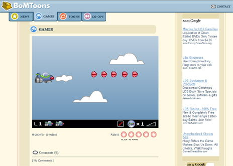
I felt like my all-flash site was getting a little dated so hopefully this is an improvement!

Please check it out and let me know what you think!

BoMToons.com

newsite.jpg

Updated: 01/06/08 12:05 AM Log in to comment! | Share this!

The People Have Spoken

8 Comments

Jan. 6, 2008 | 12:10 AM TheCriminalDuder says:

First? :3

lol Awesome redesign! ^^ Very easy to navigate and clean.
Lookin' forward to whatever ya come up with for '08 too BoMie. <3

Jan. 6, 2008 | 12:12 AM BoMToons responds:

Thanks, glad you liked it. I hope '08 is a good year for you too.

Updated: Jan. 6, 2008, 12:23 AM

Jan. 6, 2008 | 12:36 AM Kart-Man says:

I like it! It's very clean and stylish, especially in comparison to that old Flash site.

Jan. 6, 2008 | 12:39 AM BoMToons responds:

Thanks, that was one of my main goals: to eliminate any confusion with navigation and such...I just hope that no one's disappointed at the lack of "whimsy"

Updated: Jan. 6, 2008, 12:39 AM

Jan. 6, 2008 | 12:44 AM ShortMonkey says:

I like it! :D

Jan. 6, 2008 | 12:51 AM BoMToons responds:

- - - - :3


Jan. 6, 2008 | 1:42 AM Afro-Ninja says:

good stuff, though I always did like the cartridge format of the old one : )

Jan. 6, 2008 | 1:59 AM BoMToons responds:

Yeah, I'm sad to see that go too...it was a real unique experience for visitors, now I'm just another html-ish website.

Updated: Jan. 6, 2008, 2:22 AM

Jan. 6, 2008 | 11:15 AM Gmagnum says:

Like this one better than the last, an easier showcase of all your work.


Jan. 6, 2008 | 12:24 PM molkman says:

The comments page of the news looks a bit messed up and it is really annoying that you can't click "back" in your browser to get to the website you had visited before bomtoons. Other than that it looks really nice and clean.

Jan. 6, 2008 | 2:34 PM BoMToons responds:

Ah yes, I hadn't realized that you can't click back...it's because of an auto-redirect I have on the old site...I'll look into fixing that when I get a chance. Thanks for checking it out!


Jan. 6, 2008 | 1:57 PM jmtb02 says:

Only you could pull off the pink stripe. Nicely done.

Jan. 6, 2008 | 2:34 PM BoMToons responds:

Hee hee, I wondered if anyone would notice.


Jan. 6, 2008 | 3:47 PM Mogly says:

I didn't like your old website atall so this was an improvement straight away. I think it's alright, nothin major, nothin bad. it's aiight.

Looks a bit wide on my monitor though, I think it'd be better if the site was a fixed width. So say if you moved the right column and contact button over to the left and then had a 'back-back-ground' surrounding the whole page i think it'd be better.

Jump to Entry: [ 159 | 10 | 11 | 12 | 13 | 14 | 152638 ]