00:00
00:00
BoMToons
So many times, it happens too fast...you trade your passion for glory. Don't lose your grip on the dreams of the past, you must fight just to keep them alive.

Age 44, Male

Software Engineer

Somewhere in Nevada...

Somewhere in California..

Joined on 11/29/05

Level:
40
Exp Points:
17,154 / 17,760
Exp Rank:
1,350
Vote Power:
8.10 votes
Audio Scouts
1
Art Scouts
10+
Rank:
Police Officer
Global Rank:
14,798
Blams:
242
Saves:
415
B/P Bonus:
10%
Whistle:
Gold
Trophies:
59
Medals:
1,394
Supporter:
9y 22d
Gear:
17

Looking back, looking forward

Posted by BoMToons - April 3rd, 2016


One thing I've seen over the past year or so is that, working steadily, my art style has evolved a lot and gained a bunch of nuances and quirks. The progress is imperceptible day to day, but over time I can't deny that I've made some significant gains. Looking at the art from when I first started Super Chibi Knight, compared with what I was producing at the end... there's a marked difference.

A lot of my stylistic progress came from working with someone who pushed me out of my comfort zone as an "art director" for a mobile game that was just recently released. He was almost NEVER happy with my first drafts and often gave me specific feedback that led me to push my boundaries. I disagreed with his feedback every time (vehemently on occasion), but I have to admit that, in the end, his influence was really positive (once I calmed my artsy ego) and helped me get to a "new level." I feel a little sheepish working with other people whose standards are higher/different than mine and whose instincts are ultimately more dialed into what will be popular/successful in the world of game dev. Apparently I still have a lot to learn.

The game I did all this art for is called, "Good Knight Story." It took the publisher over 2 years to release it and it just came out a couple days ago. For a while I was worried all my work would be lost to the ages (because of the delays), but it's cool to see something out there that has my art in it. It's a bit weird not to be involved in ANY of the other parts (coding, music, voice acting, testing, marketing, etc.) But I'm still proud of it in a strange way. Here's a gameplay video running on an iPad (notice how the publisher dismisses the interviewer's comment about the nice art style at 1:54 ish...):

Here's an article about the game on appadvice: http://appadvice.com/review/good-knight-story

FYI: @ricepirate and @thatcomposerguy also worked on it (weird how the publisher tracked them down independently of my influence) - So we collaborated on this game via a 3rd party!

Of course, now I notice nuances in others' art that I was oblivious to before that encourage me to keep aspiring for improvement, but it's good to recognize progress in yourself every once in a while.


You may remember my last post about the little financial fiasco that blind-sided me out of the blue and forced me to take on a side project. That project is nearing conclusion and I'm really proud of how it's turning out. It won't be my most epic game ever, but the concept is cool and I drew a TON of art for it in record time.

I'm hoping it meets some decent success on the web and the publisher will be interested in deepening the concept for a mobile/steam release. Here are the 32 enemies I drew and animated for it over the last 2 weeks (spoiler alert!):
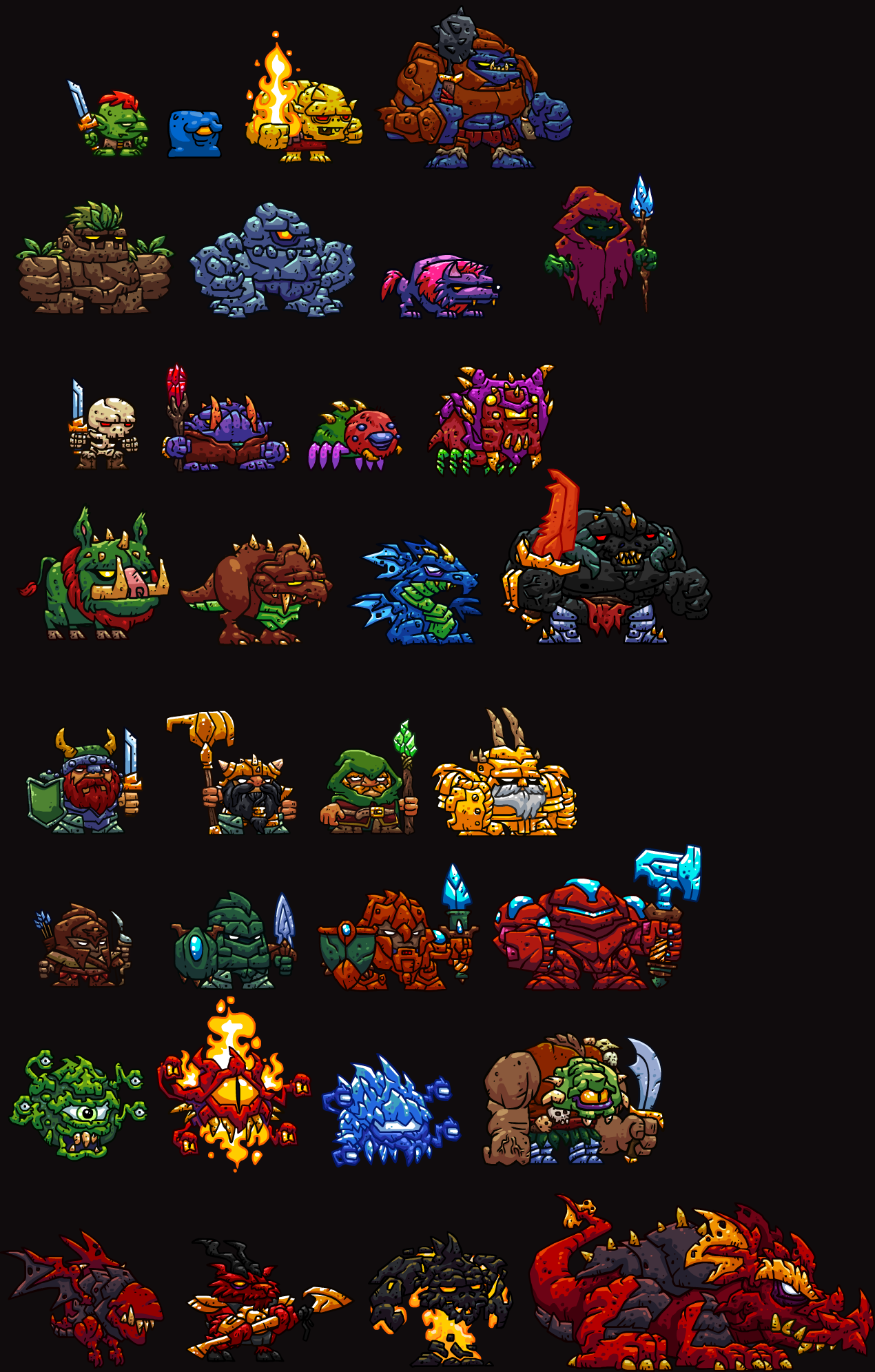
1405066_145973888412_dungeoner.png

Which is your favorite?


Finally, here's a cool animation that reminded me of @butzbo's style:


Have you noticed any changes in my stuff over the last couple years?


Comments

The game looks very appealing! It's always interesting to get a glimpse of what you're up to. Definitely going to check the game out soon.

I'm sure that the publisher was dismissive about the art comment because he was thinking "Duh, of course it looks amazing. Because BoMToons."

Ha ha! I think he was nervous and trying to stay "on script" about the game, the art comment from the interviewer was probably unexpected :-D

Yeah, check out the game, it's "Free to play" but not annoyingly so.

Shoot! I totally forgot to answer your question in my previous post. Honestly, I really like the regular Beholder, but the Flaming Beholder (or whatever it's supposed to be) right next to it is even more epic. Aw, yeah.

That flaming beholder is a contender for my favorite list...

AHA! I thought this game had your mark! I'm certainly glad it was genuine BoMToons flair, and not someone *ahem* liberating your style. And yes, I have noticed your art changing.

My style is a blend of stealing others' styles too, so don't hate the thieves too harshly... I'm just glad I'm getting somewhat of my own direction going in art now... took a long time imitating...

And the big guy in the red armor with the hammer is my favorite.

The robot-ish guy?

I glad to read that you managed to improve your art and actually come to find out that it's because of someones critique, even if it's in hindsight. I'm usually very blunt, a little bit to blunt sometimes, but I'm like that with myself as well. I know not everybody can take that kind of talk, so sometimes I rather not say anything at all. Even if it's sole purpose is to help the artist, never to insult or degrade their work.

"You may remember my last post about the little financial fiasco that blind-sided me out of the blue and forced me to take on a side project. That project is nearing conclusion and I'm really proud of how it's turning out."

Pride is a sin my friend and you're going to hell for that. Just kidding, good to know it turned out fruitful. Rock on.

Thanks for the comment, I'm a sinner.

You made 32 monsters in 2 weeks!? Woah dude!
I have definitely noticed your improvements. Your art work is a lot more recognizable now. You also found an amazing balance where the art is somehow "busy" and clean at the same time. There is always a lot of colour, texture, lines and shading and somehow it all just fits in a nice appealing way. It looks super cool!

I like the colours of the floating wizard character in the 2nd row.
I also like the red demon goat in the bottom row. Actually the entire bottom row is filled with really strong designs.

It appears that the floating medusa head is an updated version of the enemy from Good Knight Story. These projects aren't related are they? Perhaps it was just a quick artistic liberty?

Thanks man! Yes, those beholders are re-dos of the Good Knight Story beholders. I wanted them a little simpler/tighter and cuter for this game. Also, conceptual design takes a long time and they were already conceptually strong, so I re-purposed them. But no, the projects aren't related except in that I felt comfy doing art in the side view style and kept that rolling from GKS to this.

Interesting, thanks for the share. I should try working for someone else; I could use being pushed too.

Uncomfortable growth, but definitely kicked me up a notch. It takes the right person too, someone who can push with specifics, but also appreciate what you're contributing.

It's pretty cool to see you're expanding on a pretty varied medieval-ish spectrum of works; specially on the creatures; I'd say my favourite is that rocky eyeless monster from bottom left, it comes with a cool expression.
Btw, I really like that short!,I hope to get to that level of action-driven storytellling at some point! :)

I think you're well on your way to making awesome stuff like that. Looking forward to your game!

Dude, you make some amazing monster designs. I would totally recommend you make a concept book on character design; Because you clearly have a sharp eye for that sort of thing.

Ha ha, never considered that... I don't think I'm that good at concept stuff really.

keep up the good work. I still like "Super Chibi Knight" on Steam.

Awesome! Glad you're still liking it!

Yes. The robotish guy.
And don't worry, I'm well aware that the most reliable way to improve your art is to steal tricks from other artists, the game just had so many of those I associated with you I would've been a little shocked to know it was someone else.

Ha ha, fair enough!

The game looks awesome! And no surprise, I LOVE the drinking scene in the tavern! :)

YOU WOULD!

Awesome stuff! I've always loved your style. It is still true to the Flash cartoon style but with a professional clean touch to it. Also the game looks sweet!

Thanks man, the evolution has been slow!